Well I made it, one month and one card down!
Here is the fruit of my labors, I give to you FUTURA: The Vixen From Venus!
I also have posted this on my personal blog if you are interested in seeing the piece in its entirety 3ddevine.com.
Something kind of fun that I am also throwing in these posters is hidden elements. I am planning on hiding a diamond in every piece as well as having the number represented somehow. What the hell am I talking about? Well I will just tell you for this first one. The alien has a Diamond on his space suit and the number 2 is represented by the word “Venus” which is the second planet from the sun…dorky and pointless but fun at the same time.
Thanks for looking, I will see you next week/month with the first glance at the 3 of diamonds…with the theme MEDIVAL!
| Ah yes… the familiar feeling of starting over… AGAIN. That’s right, my OCD is kickin into high gear this challuunge. |
So keeping with the future idea, I started building an hour glass. I began with wire and covered it with the clay. | Next I began sculpting a new head. I decided that the problem with the last two designs is that I tried to pigeon hole myself into an idea too early. So I just let the clay tell me what I was creating. |
| So this is what the clay told me to make. I know I sound insane (which I am) but this is how I work best. | I start kneading the clay. As shapes take form I kind of go with them. That is how I work best and that is how I will be approaching things from now on. These are a couple different shots with slightly different lighting. |
| So here is the head with a shot of the outer shell of the hour glass in the back ground. | The idea now is to make a creature that will be busting out of the card or maybe outer space, I am not sold on anything yet. So I started making an arm next. |
I then realized I needed to attach the arms to the body I had started a while back. I then created a second arm and attached it, which destroyed any details I had. | And here we are with the separate parts in the plastic bowl I use to keep these lil bastards from being destroyed in transit. |
Here we are in week 3 already. I decided that for this week I would discuss my process a little bit, so hear we go!
A: First thing I do when I open up that wonderfully intimidating blank Adobe Illustrator page is make a background color, it helps to set the mood and feel while your working, even if that color changes later it’s a good staring point. I then import my final sketch onto a separate layer and set its blend mode to multiply. By doing this it allows me to begin building my shapes underneath while still being able to see the original drawing.
B: Using the pen tool I begin to block in the main shape for the face and create her space helmet using the ellipse tool.
C: I continue with the pen tool and start to create the important features of the face. In the case of her lips and parts of her eyes I am adding a stroke to the shape as well to help define it.
D: Once all the main parts are there, I make a custom brush to use with my Wacom tablet. The tablet allows me to make strokes that can be thicker or thinner depending on the amount of pressure used, similar to an actual marker. Anyways I use this brush to add minor details, such as wrinkles and creases to help create a less sterile more “natural” look.
E: A pretty big jump from D, but at this point I am pretty much repeating the process until it is DONE….which it is, but you can’t see until next week BWA HA HA HA!
Today’s post is a little anemic but I’m going to cheat by updating it over the next day or two to flesh it out.
I want to give myself as much information as I can before diving into painting. Since I don’t have a metallic clock-faced owl on hand I made a little maquette. It isn’t the most refined thing around, but it has the basic shapes I want.
I spray painted the owl gold to get the metallic look I wanted, set up a simple lighting rig and took a batch of shots. I think it will help a lot.
Here we go with the next adventurous installment of:
| …and the story continues… |
| Week two brings me to creating the body/torso for my sculpture. Here is the wire armature to give it strength and girth. | I have added the first round of outer mass in this photo. This one is real rough. I will be adding some sort of armor later on. |
| Here we have the head undergoing some changes. I have smoothed out the eys and redone a new jaw. | It’s coming along quite nicely now. It kind of looks like it has a beard of some sort, but I kind of like the “insect” look the eyes are giving it. |
| And then a new sketch leads me to believe that I can do better. This isn’t just another crappy sculpture project, this is going to be on a playing card for spit’s sake. | Back to square one on the head. I am going to keep the torso for now and try to build it up once I get a definite look for the head/helmet. |
| At first it appears that I am creating some dreadlocked predator mask, but that is not the case, Danny. | So off come the dreads and add in the horns. Progress is slow going at this time, but check back next Thursday for more updates. |
Well here we are in week 2 already. I finished up my drawings and scanned them into the computer.
First thing I had to do was combine my drawings into one image then I started moving things around until I got the layout to be more or less in the right place. I put it into the playing card template to make sure everything would fit in this small format size. The text is just a place holder for now, still not sure what I want it to say exactly.
I threw in the blue to help give me the feel of the overall color. I really want to try and limit my color palette to a maximum of 4 colors in order to really get the feel of a screen printed poster.
The pictures below are just detail shots of the Space Girl and the alien. My next step is to take this into illustrator and start the final render. See you next week ….or should I say IN THE FUTURE!
REFERENCE
This week was all about gathering reference. I thought I’d share some.
This painting, “The Man with the Golden Helmet” has to be listed as my first bit of reference. It was very much on my mind as I thought of the story and (perhaps strangely) influenced the creation of the Clock-Owl idea. When I paint the portrait of the adult version of our protagonist I’ll be trying to get as close to this feeling as my limited skills allow.
The spread below is a collection of assorted reference. A friend and her daughter kindly agreed to pose for the figures. On the far right is a quick chop together of their pictures to give me something to look at as I start my drawings.
Hello, Wurm here. Early on in our process of creating this idea of doing art pieces for a collection, I had decided that I wanted to get better at sculpting. So that has become my goal with this project, increase my skill level at creating finalized sculptures. In the past with the weekly art challuunges I had done a few sculptures that looked pretty good in photos. However, if you were to check out the back sides of them they resembled a construction site that had been attached by blood thirsty vandals with copper shovels and Zotz® candy wrappers. All I am saying is that I aim to change this. That’s all.
So here we go with week one: the playing card for this month is the number “2”. I have the “hearts” suite so that’s pretty sweet. I may or may not incorporate these into the concepts as i go, but for now – onto this month’s concept:
I sincerely feel that in the future, there will be no procrastination. The thought of putting things off until the next day will be a thing of the past. Everyone will do exactly what they need to do when they should and the world will live in “the now”. There will be no more famine and all the voices of the humans on earth will sing as one gigantic booming voice… it will be like Barry White and Shadow Stevens had an interspecies love child with a Saint Bernard. Now that would be a tremendous voice!
Wait, where was I?
Never mind, I’ll finish that story another time… So my concept is very loose right now. I am going for an “anti-procrastination” robot sculpture that will be responsible for the end of procrastination and ultimately creating the one-world Saint-Barry-Shadow voice we will all use in unison. Here are some pics of my progress thus far…
The first photo above are some prelim sketches to flush out some pencil frustrations before beginning to sculpt. I’m new to super sculpey but it seems to be a nice medium for sculpting anti-procrastination robots.
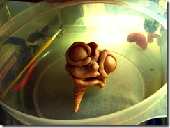
Here we have some early concepts of the front and side of the head and face. You can just smell the scent of “gotta-get-it-done-right-now-and-not-wait-until-tomorrow” as the piece begins to take shape in these early stages.
So before we started pulling random words and assigning suits and all that razzmatazz, I decided that I was going to theme my suit by making faux vector style posters. Seen in these pictures is the beginning of my “future” themed card for the 2 of diamonds.
In my head I instantly saw a poster for a pulp science fiction style movie. I knew I wanted to have a pin-up space girl and some sort of alien so I messed around with several thumbnails. A & B are a couple of them. C is a slightly more fleshed out thumbnail of A. Here I figured out the general layout and overall feel of the poster.
In the second picture I threw together a few of my initial sketches of the alien, who at one point started to look like a rabbit, not really happy with any of these so far but you got to start somewhere.
The third picture is an early sketch of the Space Girl, who I will probably name Futura (good idea Andrew). Still in the works, we will see where we end up in the weeks to come.
This first image is what most of my ideas look like when they first get going; not much. It’s just something down on paper so I don’t forget it later. Here’s how this line of thought went: “Future.” Clock. Clock face. Barn owls have round flat faces. Clock-faced owl. Owls feel wise. More of an ancient wisdom tied into nature. This owl is time.
I knew I wanted to create a narrative I could pull through the whole Artist Deck set. The guide/mentor is a classic character archetype and to have your guide be Time itself… could be cool. Let’s start with a young character’s discovery of the owl-clock, frozen as if it has simply been used as a timepiece for the last 100 years. To reinforce the word Future a much older version of our protagonist will hang above to scene, almost entirely in shadow, as if looking back on a memory.
These last two images are me trying to figure out what an owl-clock looks like and a small charcoal thumbnail starting to figure out composition. I don’t like using pencils for thumbnails because it’s sooo easy to get into too much detail. The downfall is that they don’t make sense to anyone but me. It’s not like I can show that thumbnail to someone and say, “see what I mean?”